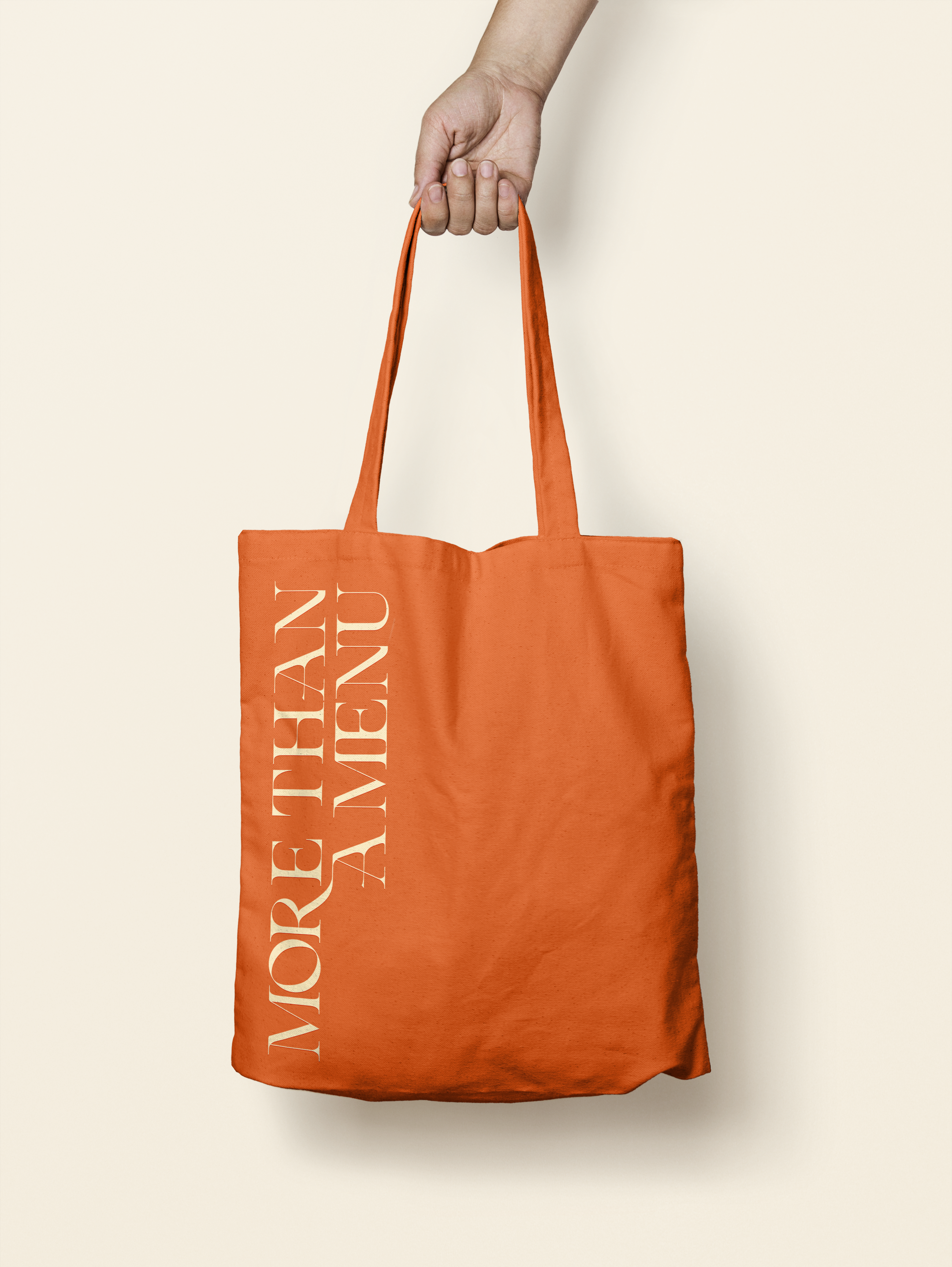
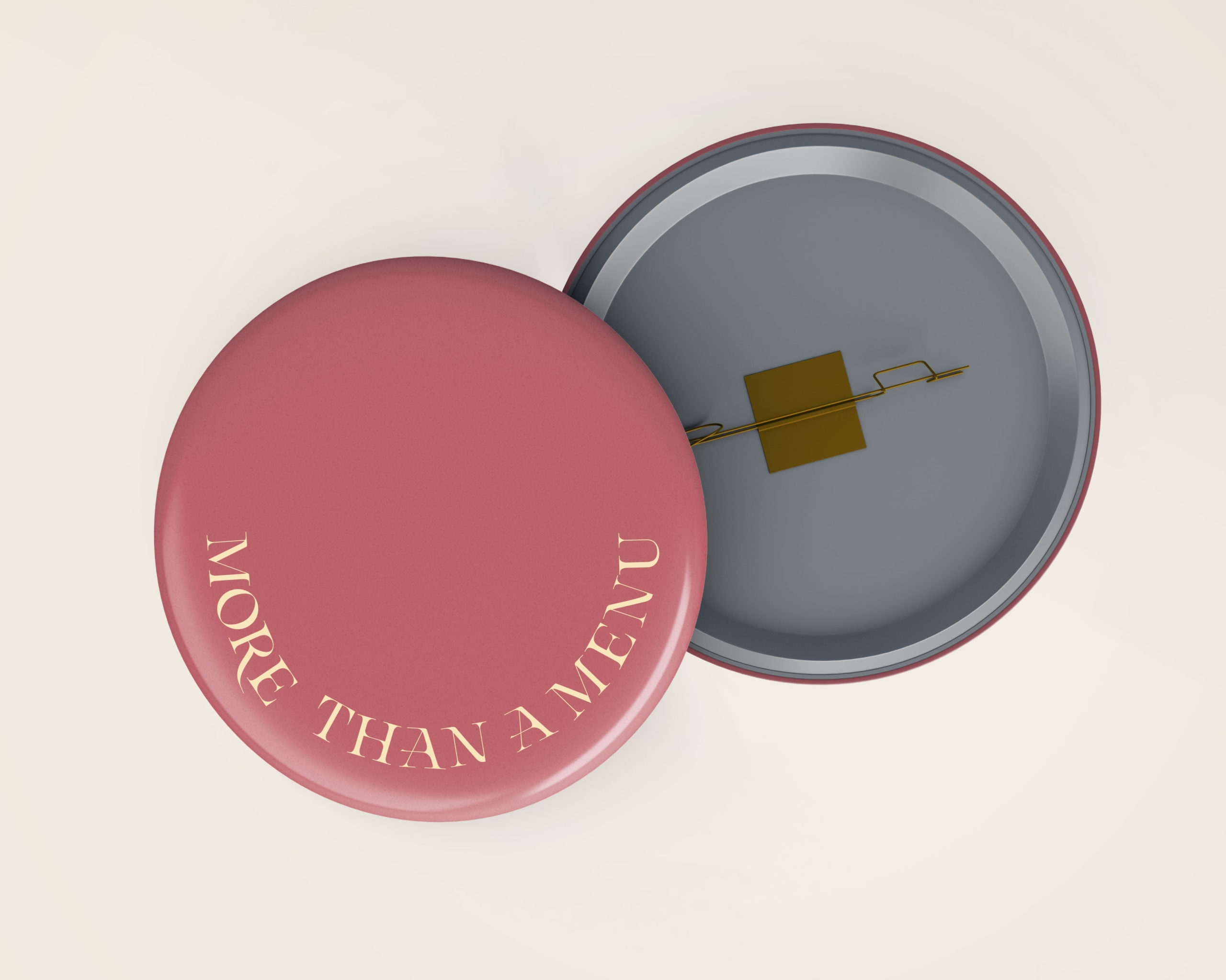
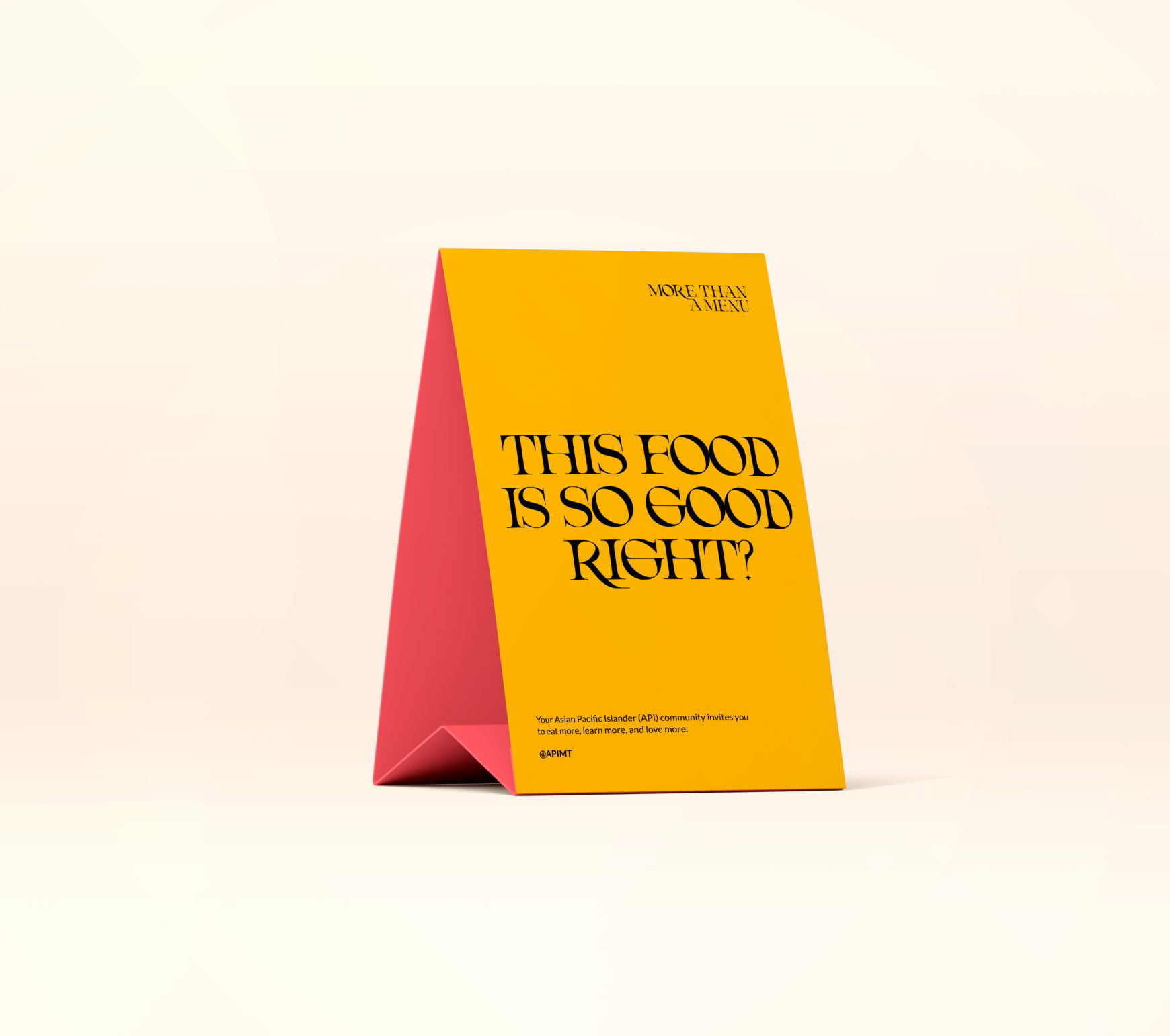
More Than a Menu
Contribution
Art Direction
Collaborators
API Middle Tennessee
Farmuse
Writer
Yurina Yoshikawa
Type Design
Emily Jing Sum Chan
Year
2022
About
A campaign run by API Middle Tennessee to spark curiosity, stir meaningful conversation to awaken empathy and spread empowerment.
"Food is many things. Food is history. Food is therapy. It can teleport us back in time
and shake loose old stories. Stories full of life and laughter. Food has the power
to soothe souls. We’d like food to be a bridge. To bring us closer together."
- Yiruna Yoshikawa
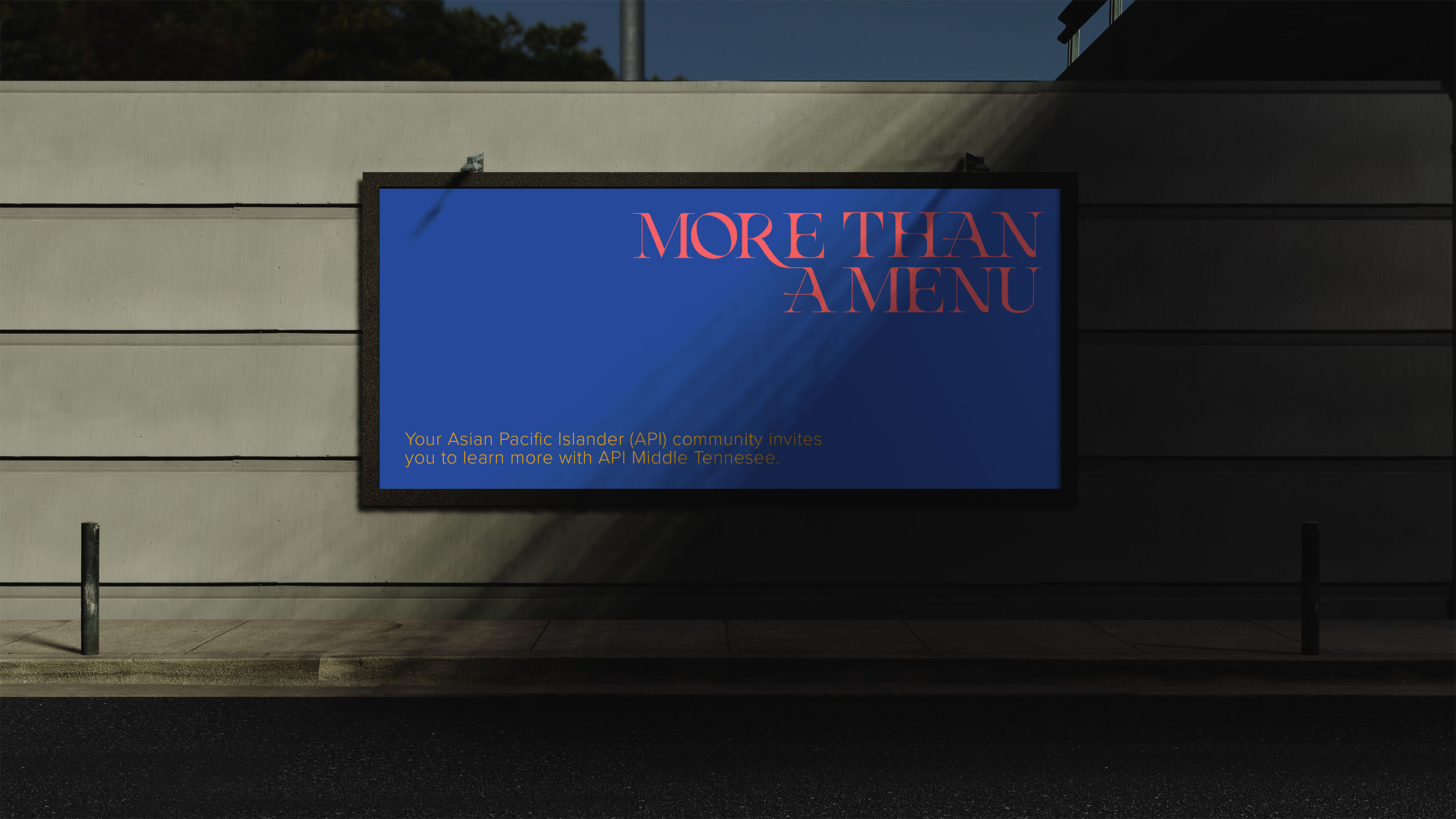
More Than A Menu is an invitation to learn more about your local API community.
It's also a place where API people can connect with each other to feel less alone.
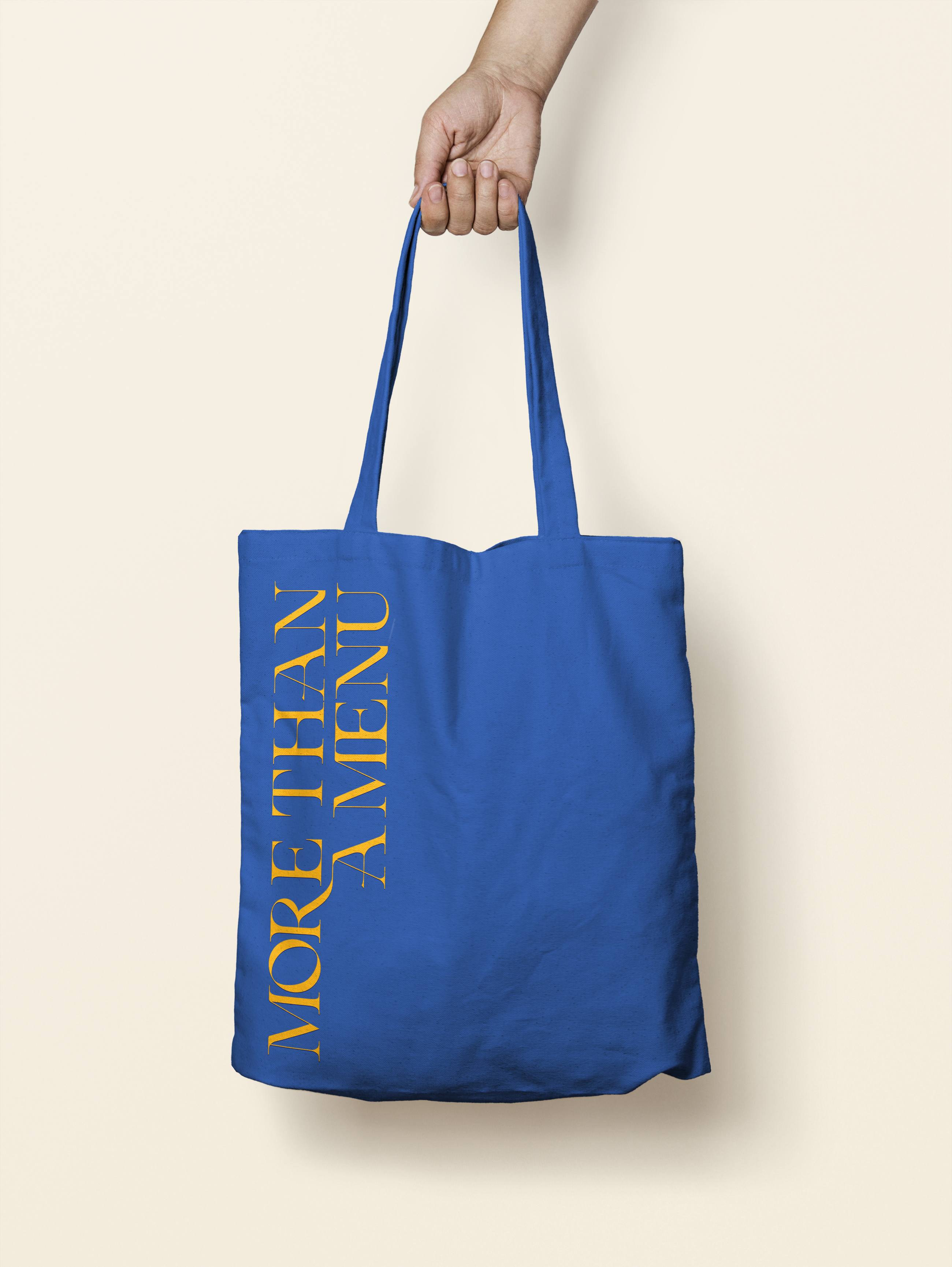
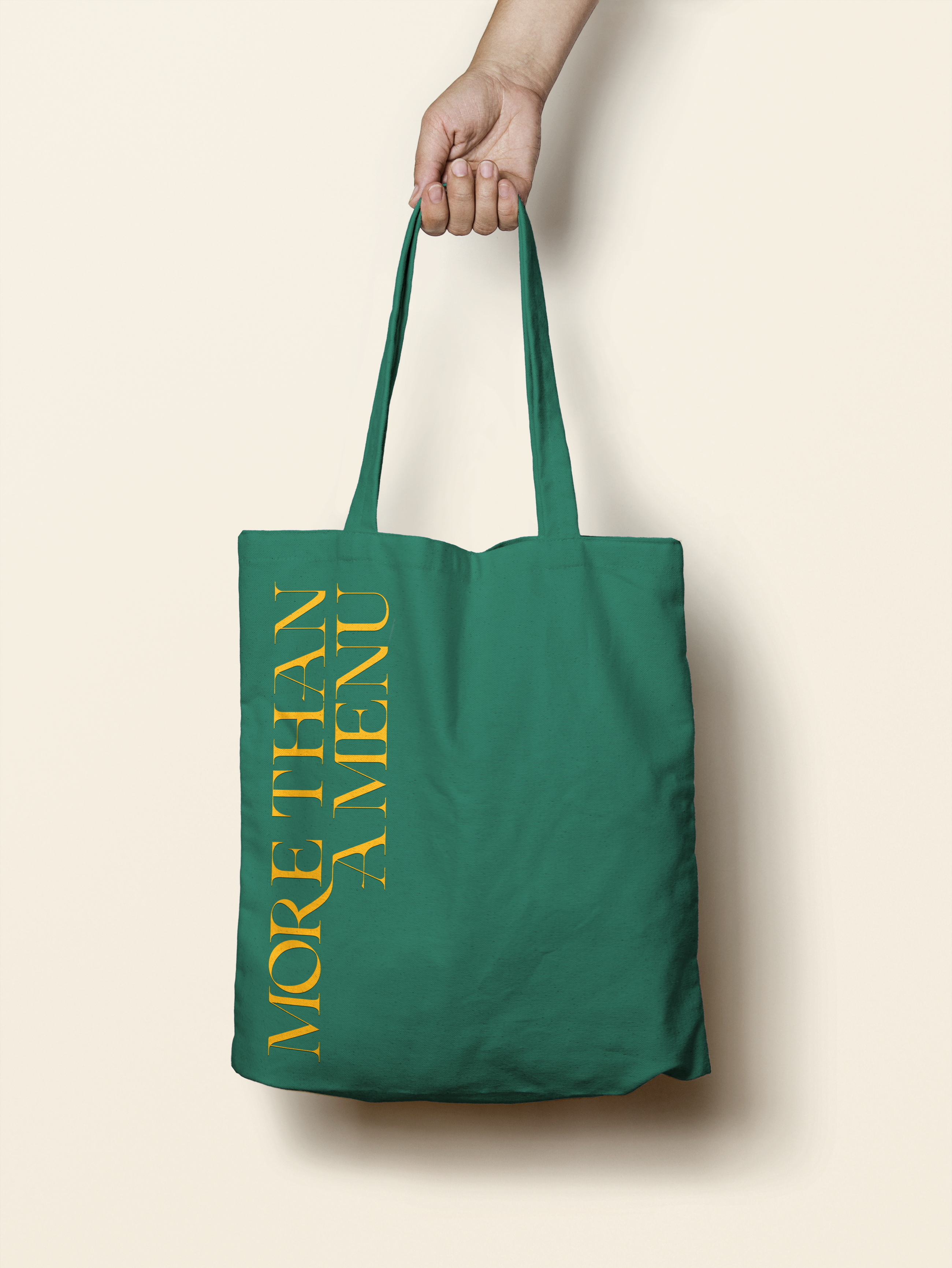
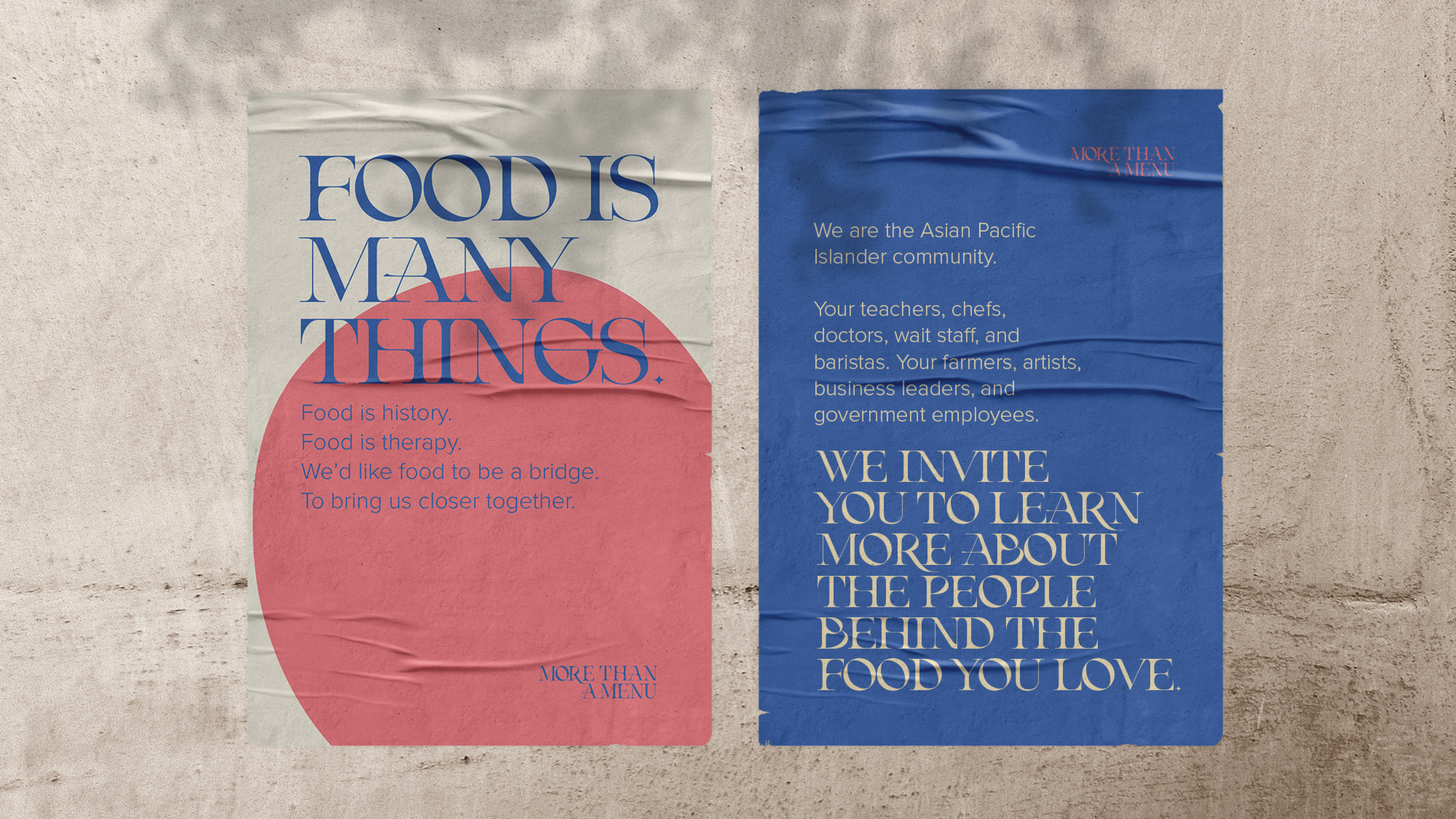
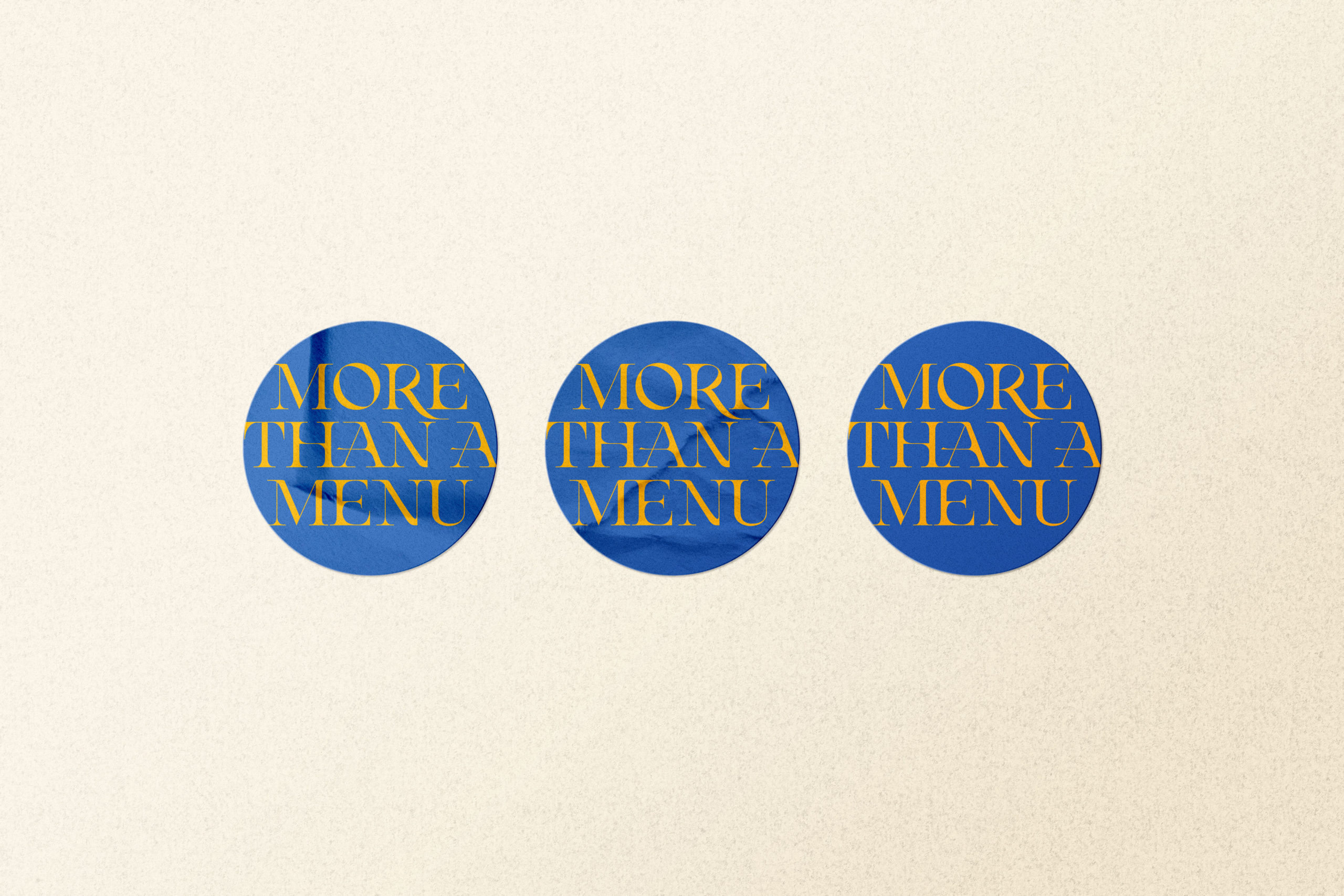
Welcoming and fun, Asian food also deserves to be taken seriously. The tension between the color palette and typeface is an essential ingredient in the visual direction of More Than a Menu.
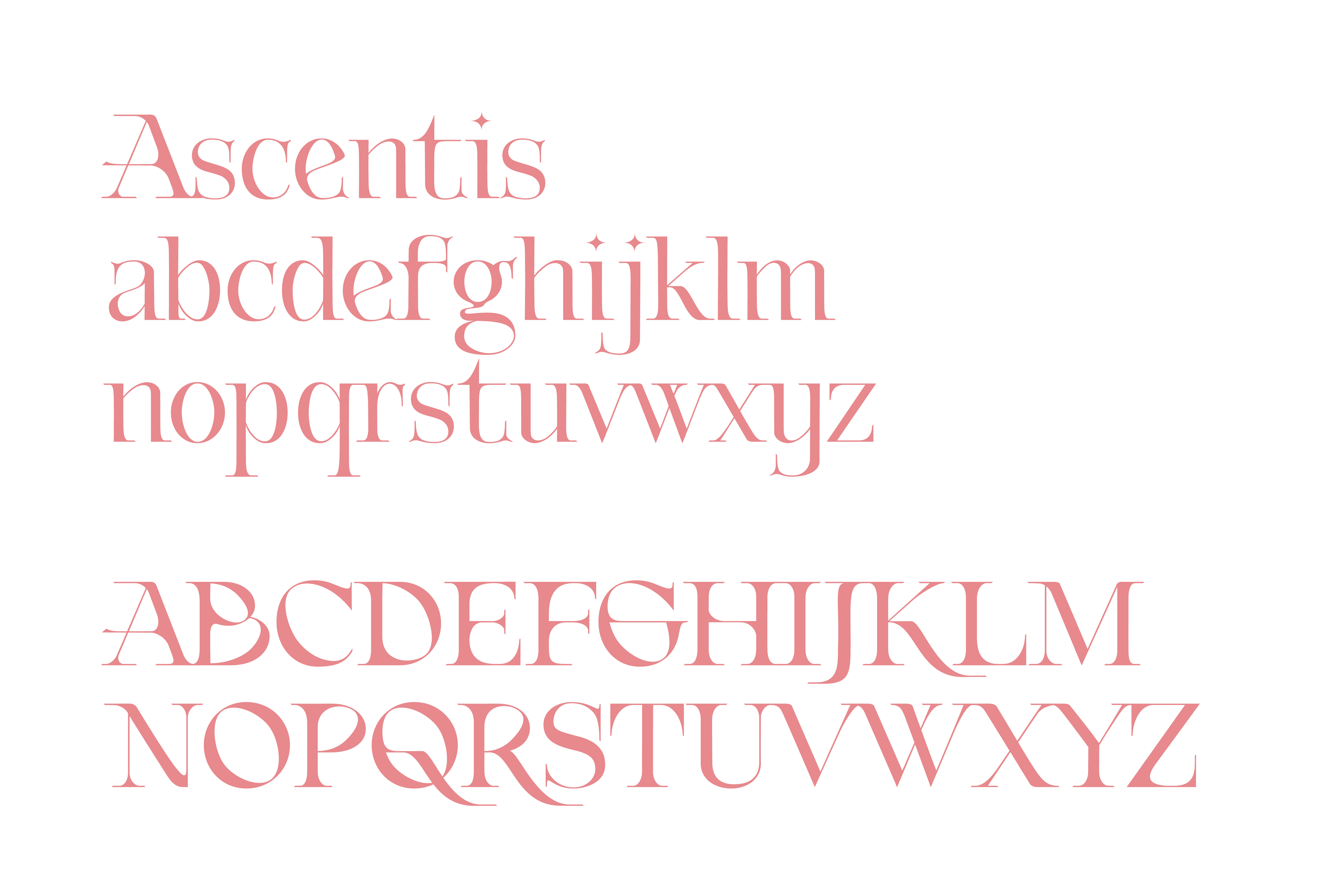
About the Typeface by Emily Jing Sum Chan
Ascentis falls in the realm of display typefaces inspired by Neoclassical typography, sprinkled with a contemporary twist. The serifs and contrast between thick and thin strokes pays its respects to Neoclassical typography. Yet the experimental star-shaped terminals offers a stinging sensation; and the intense, deep curvatures allows the letterforms to melt into their respective spaces. This seamless fusion of sharp and smooth, historical and modern, creates an emphasized edge to Ascentis’ fluidity and unconventional character. Ascentis not only visually acknowledges the history of Typography, but also pushes the boundaries of what typographic conventions can be.
Copyright 2020 © Lilian Vo. All Rights Reserved.